Adaptive UI Concept
With
the launch of bigger screens of iPhones , Apple also
introduced Adaptive
UI concept.
There are some main things you should know to work with Adaptive
UI.
1) Size classes
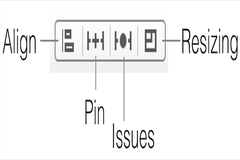
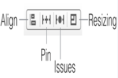
2) Align – Create alignment constraints, such as aligning the left edges of two views.
3) Pin – Create spacing constraints, such as defining the width of a UI control.
4) Issues – Resolve layout issues.
5) Resizing – Specify how resizing affects constraints.
1) Size classes
2) Align – Create alignment constraints, such as aligning the left edges of two views.
3) Pin – Create spacing constraints, such as defining the width of a UI control.
4) Issues – Resolve layout issues.
5) Resizing – Specify how resizing affects constraints.
First
Size Classes
There are two type of size classes horizontal (regular or compact) and vertical (regular or compact)
Here is you can see which classes cover which device
Horizontal regular, vertical regular: iPad in either orientation
Horizontal compact, vertical regular: iPhone portrait
Horizontal regular, vertical compact: no current device
Horizontal compact, vertical compact: iPhone landscape
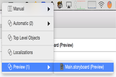
At the bottom of IB window , there control that allows to see which classes cover which devices.
There are two type of size classes horizontal (regular or compact) and vertical (regular or compact)
Here is you can see which classes cover which device
Horizontal regular, vertical regular: iPad in either orientation
Horizontal compact, vertical regular: iPhone portrait
Horizontal regular, vertical compact: no current device
Horizontal compact, vertical compact: iPhone landscape
At the bottom of IB window , there control that allows to see which classes cover which devices.
You
can see the outcome of the screens on iPhone and iPad in all
orientation with changes in storyboard by View->Assistant Editor
-> Assistant Editor on Right and switch Assistant editor.
After
selecting the view in storyboard ,it will list all constraint for
that view in Size Inspector.
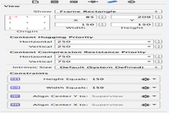
after
selecting the view in the storyboard, you can see following bar at
right bottom side.
On
the pressing the Align tab, you will see
Here
you can set all alignment constraints with respect to its
superview.
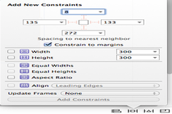
On pressing the Pin tab , you will see
On pressing the Pin tab , you will see
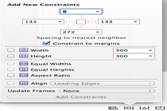
By
check the constrain to margins, you can set the margin of the view
with its superview, also can set width and height.
For such more Blogs you can visit to http://findnerd.com/NerdDigest
For such more Blogs you can visit to http://findnerd.com/NerdDigest
No comments:
Post a Comment